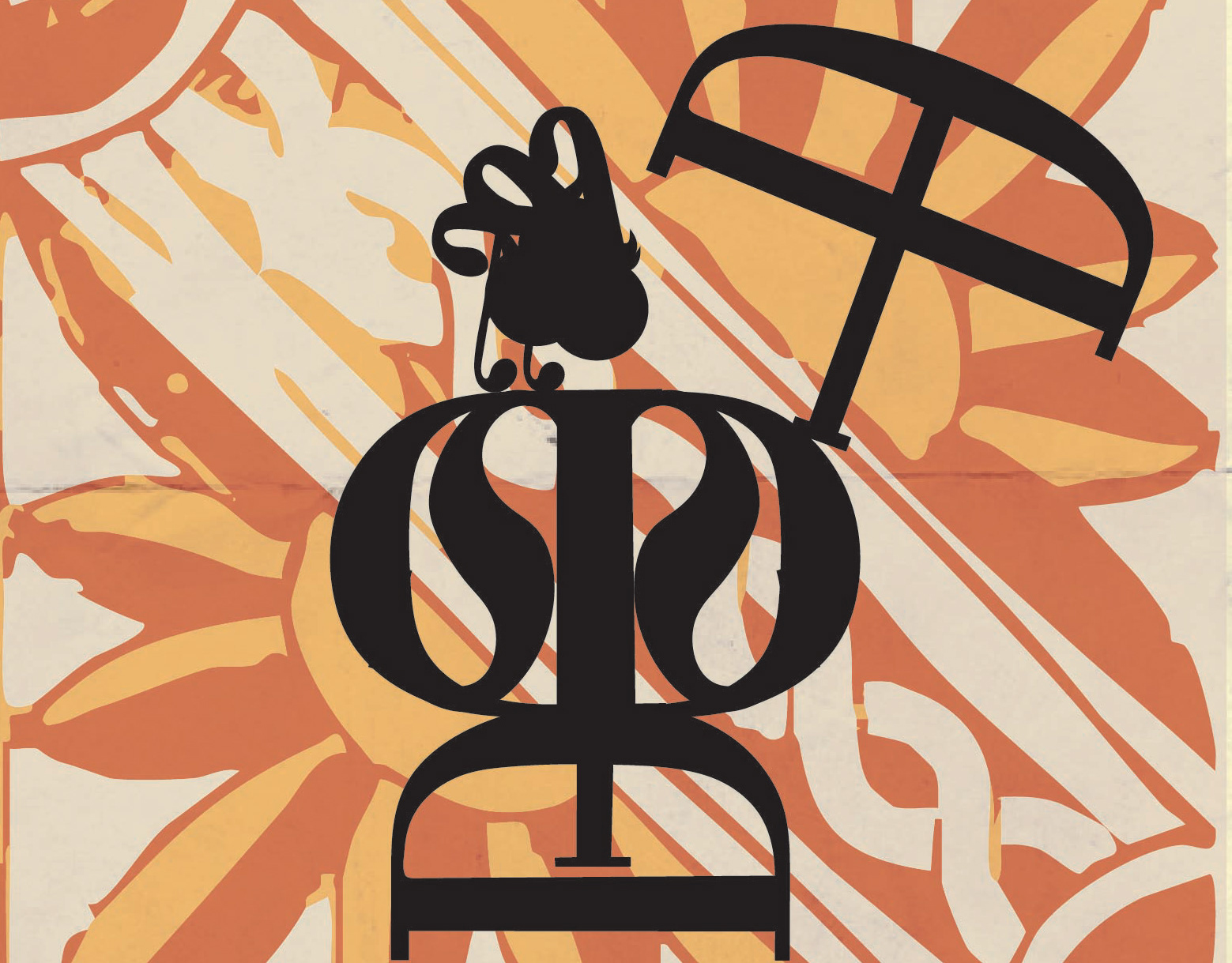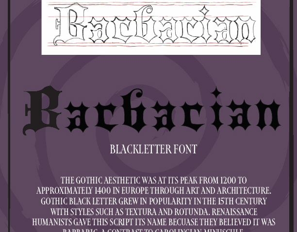
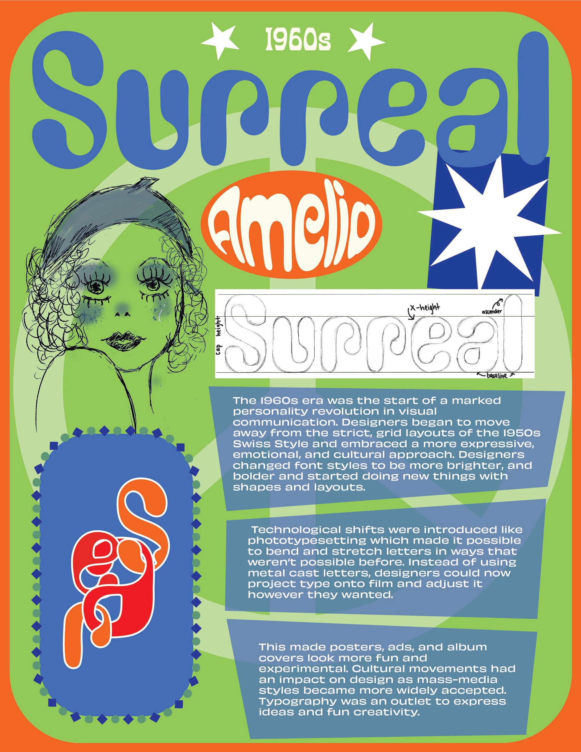
"The 1960s era was the start of a marked personality revolution in visual communication. Designers began to move away from the strict, grid layouts of the 1950s Swiss Style and embraced a more expressive, emotional, and cultural approach. Designers changed font styles to be brighter and bolder and started doing new things with shapes and layouts. Technological shifts were introduced, like phototypesetting, which made it possible to bend and stretch letters in ways that weren’t possible before. Instead of using metal cast letters, designers could now project type onto film and adjust it however they wanted. This made posters, ads, and album covers look more fun and experimental. Cultural movements had an impact on design as mass-media styles became more widely accepted. Typography was an outlet to express ideas and fun creativity."
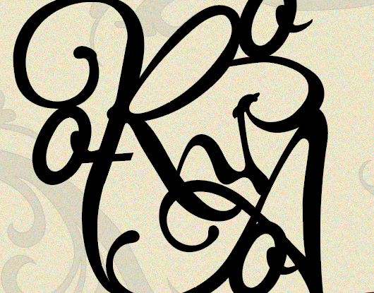
For this project, I based my page design on the 1960s. The font I chose to focus on was Amelia BT because of its funky and curvy design. I used Photoshop and Illustrator to reach my final composition and used bright colors to match the theme of the 60s.