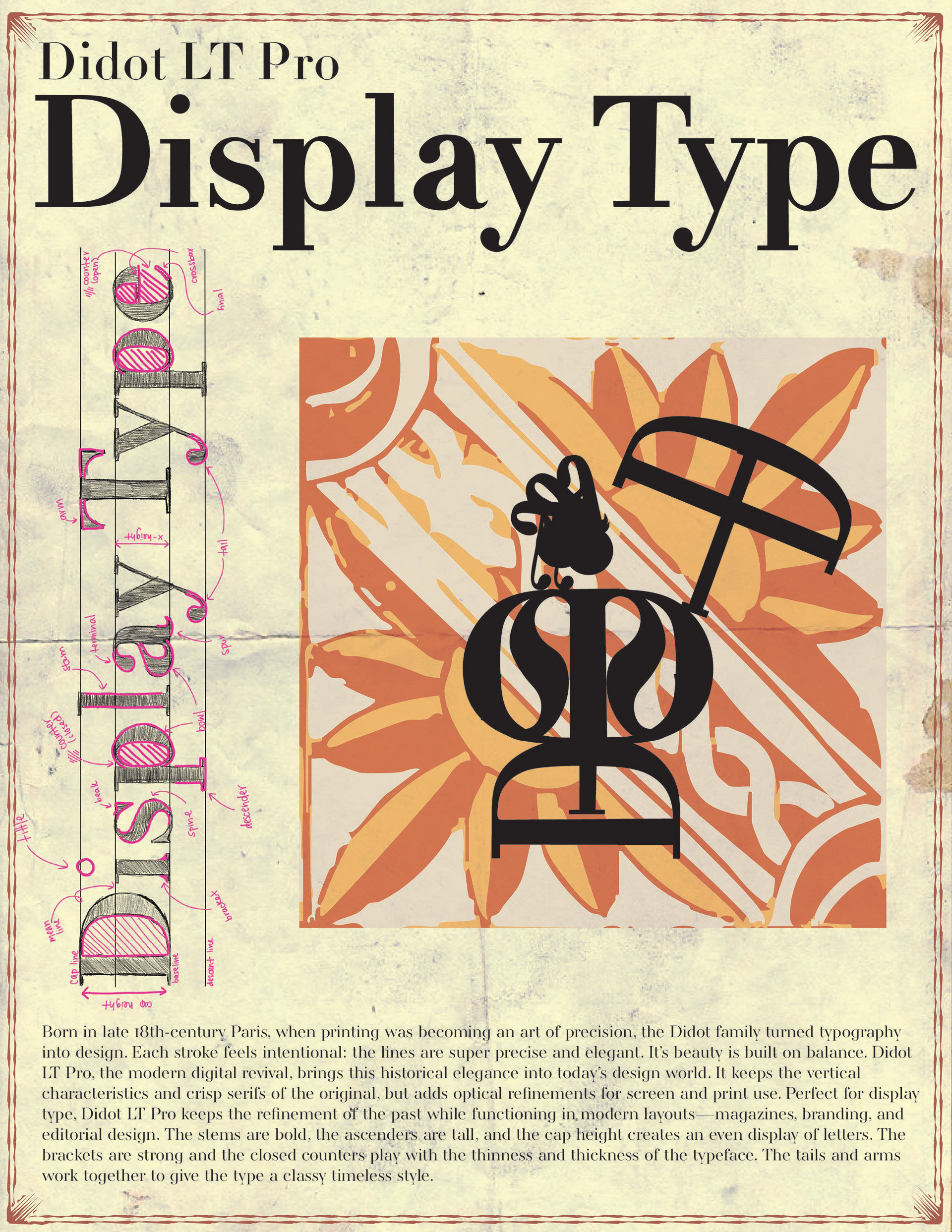
"Born in late 18th-century Paris, when printing was becoming an art of precision, the Didot family turned typography into design. Each stroke feels intentional: the lines are super precise and elegant. Its beauty is built on balance. Didot LT Pro, the modern digital revival, brings this historical elegance into today’s design world. It keeps the vertical characteristics and crisp serifs of the original, but adds optical refinements for screen and print use. Perfect for display type, Didot LT Pro keeps the refinement of the past while functioning in modern layouts—magazines, branding, and editorial design. The stems are bold, the ascenders are tall, and the cap height creates an even display of letters. The brackets are strong, and the closed counters play with the thinness and thickness of the typeface. The tails and arms work together to give the type a classy, timeless style."

For this project, I chose the Didot LT Pro font to use as the basis for my typographic page design. I based my page on Italian influence with the Latin alphabet. I started by tracing the letters on Photoshop and adding anatomy terminology. I then moved on to Illustrator and traced the letters to create my compositional design.